
Internal Communications Committee (ICC) Report to the 2013 AGM
Committee Members
Toufic Boulos (Eastern Regional Councilor), Jay Chan (President), Shannon Munsie (Vice-President), Athena DeBrouwer (Central Regional Councilor), Linda Lan (Western Regional Councilor), Paul Harris (CDSPI). Committee membership was amended due to Council member availability.
Preamble
The Federation of Canadian Dentistry Students’ Association (FCDSA) wishes to draft a plan of action by which it can make dental students aware of the FCDSA, and create a portal where communication from and to dental students can be easily achieved.
Report
CDSPI has been extremely helpful with the work of this committee. The concept of “Branding” was brought up by Mr. Paul Harris (Marketing Vice-President), who was nice enough to draft a list of questions that the ICC and the FCDSA executive committee were to think of in order to decide what image the federation was planning on projecting to the students, and how it planned to do so. Below is the list of questions and the discussion points brought up:
1. What is the purpose of the branding?
Connect, advocate and support
- Support and promote professionalism and ethics
- Connecting student associations, advocating what we think as students is important
- Writing articles and papers in order to advocate certain ideas
2. Who are we trying to reach (who is the audience) and how?
Our current students, through our council members
- We want to empower the council members – so we should connect with them through all the students
- At some point we’ll need to be able to connect with dental students everywhere
- One of our long term goals – connect with them ourselves, add a member on the board for Communications?
- Integrated approach – ask the council members to relay messages, but maybe also have a website newsfeed or a newsletter
Prospective students?
- What’s the spirit of each school? Creating a kind of a profile for each school on our webpage, helping students make a more informed choice as to where they want to study – but that would be the extent of it
Sponsors – our brand needs to reach out and tell them what we’re doing. The webpage will be very useful in that regard.
3. What is important to our audience?
- Boards, national exams, educational challenges
- Sharing best practices
- After dental schools: how to apply to specialties etc. Maybe we can develop a part of our website dedicated to residency information.
- Being the hub for all the future opportunities
- Setting up exchanges across Canada between different dental schools
4. What is the general message we want people to receive about the Federation?
We represent them and their interests. We are here to help them connect with other dental students in Canada. We are here to give them the resources they need to optimize their educational experiences. We are here to serve them and advocate for them.
5. What can we offer?
- Message board – students connecting to other students à implement and moderate, post some discussion ideas
- Hosting our own event and inviting other students, like the International Dental Student Convention or research symposium or sporting events (Dent Games etc…)
- Organize student teams to go abroad and provide dental care (community work)
- Help students make informed decisions
6. What do we want our audience to feel?
- We are trustworthy
- We are easily reachable (they can connect with us without too much trouble)
- We are reliable
- We advocate for them, not what other entities are interested in
- Make them feel that they are part of something, we are with them
7. What do we want our audience to do?
Volunteering abroad, connect with other dental students across Canada, be aware of what we do, actually use the resources we make available for them, contact their student representatives in order to ask for help in issues and events that we can assist in resolving, spreading the word about our federation…
8. How should our audience contact us?
- Through council members, then the regional councilor and finally the executive
- We also want to keep our image of being trustworthy and accessible, so it would be important to have an email or contact information by which students can reach us directly without having to go through the hierarchy.
Proposals for Logos
The following is a submission sent to the Executive by Mr. Paul Harris of CDSPI. It is presented to Council for your consideration.
We’ve been working on the logo ideas for a number of weeks now. The work progressed keeping in mind the idea of the connections between the students, student governments and the Federation, since that is one of the central parts of your messaging. David has come up with some exciting ideas (attached as a pfd), each with a different approach and feeling. To this point the logos are in black and white – once things are narrowed down, we can work on colour versions.
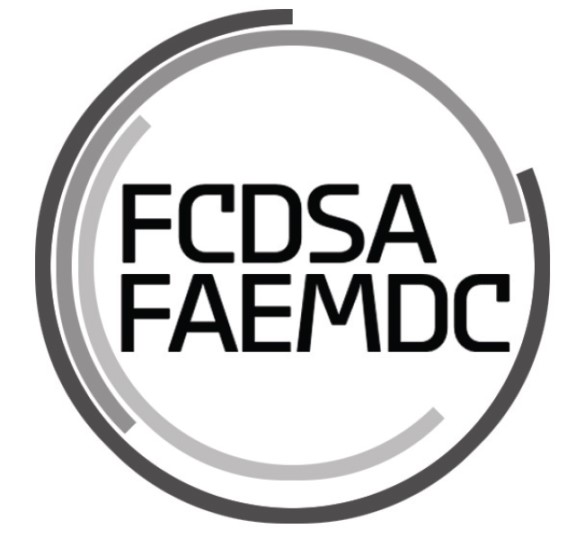
Design 1: This first, round design is a contemporary and strong one. It is meant to represent the three groups – students, students governments, and the Federation – through the three pieces of circles. Each piece overlaps with the other pieces but each has its own identity. Together they form a complete circle – with the Federation at the centre. It projects the message that the Federation is dynamic and progressive.
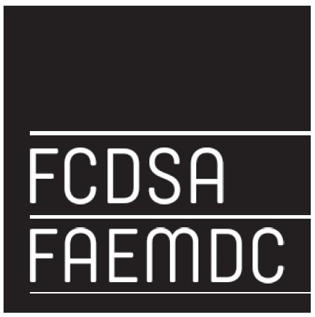
Design 2: The second design is a very elegant one, with varying width lines offering subtle interest. In this design, the three lines once again represent the three groups – students, student governments and the Federation – joining at the edge of the box. It projects solidarity and control.
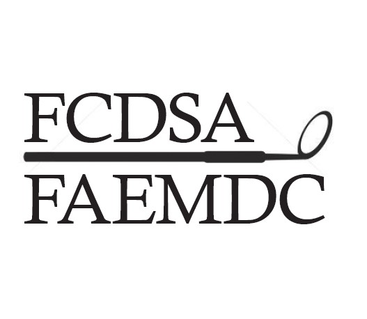
Design 3: The design is a more “retro” one, both in terms of the traditional font and use of a representational graphic for dentistry. It projects a permanent, reputable and dental image.
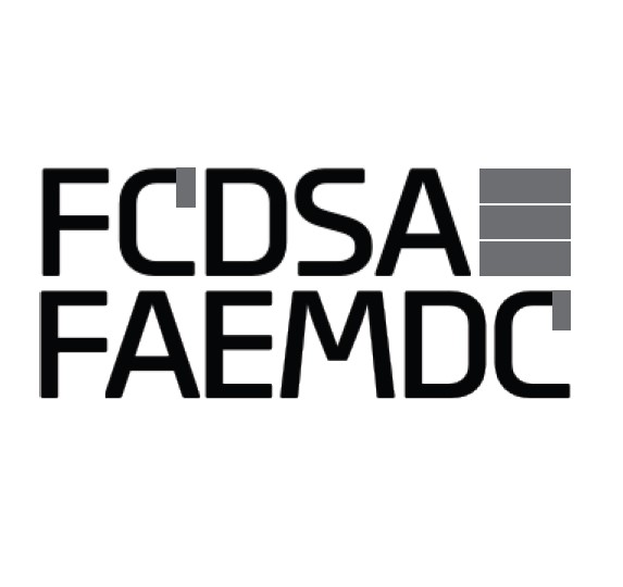
Design 4: This design is a modern, somewhat edgy one. The box within the log represents the three groups, with the touches of different colour on the “Cs” meant to be eye-catching and fresh. It projects newness and forward-thinking.
Design 5: This design is graphically bold but grounded, straddling modern and traditional styles. The graphical elements represent the three groups and their interconnections, but are also a stylized “F” for Federation. This logo projects a feeling of strong foundation and a forward-looking orientation.